
A DMC thread color card is a reference tool that shows DMC floss colors in a single organized place, so you can choose shades, compare close colors, and make safer substitutions before you stitch. The most useful version is the threaded card, which includes real floss samples rather than ink-printed color blocks. To use it well, think of it as a decision tool: first identify the color family, then compare nearby shades in natural light, then check whether the floss will create enough contrast in your design. If you pick colors for embroidery or cross stitch often, a color card helps you avoid buying the wrong shade and makes pattern changes much easier.
Quick Answer
The simplest way to use a DMC thread color card is to match by number, color family, and contrast.
Start by locating the DMC number from your pattern if you have one. If you do not, scan the card for the general color family you want—reds, dusty blues, warm neutrals, greens, and so on. Then compare the shades right next to it, because many DMC colors differ by only a small shift in depth, warmth, or grayness.
A threaded card is best because real floss reflects light differently than a printed chart or a screen image. That matters when you are choosing skin tones, leaves, shadows, or background fills where subtle changes show up clearly in stitching.
Use the card for four main jobs:
| Use the color card when you need to… | What to look for |
|---|---|
| Follow a pattern exactly | Confirm the DMC number and shade family |
| Substitute an unavailable color | Find a nearby value and undertone |
| Build your own palette | Group colors from light to dark |
| Compare similar shades | Check contrast in real light |
The main takeaway: a DMC color card helps you choose thread more accurately than guessing from photos, labels, or memory.
How to Think About This Topic
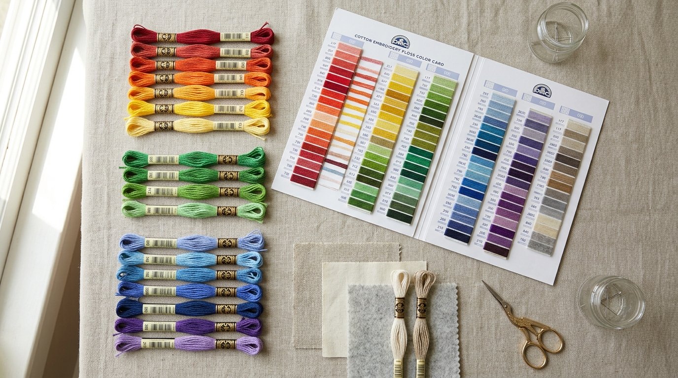
The most practical way to think about a DMC color card is as a map of relationships between colors, not just a catalog of thread numbers.
When you first look at the card, it can seem like a long list of shades. But for actual stitching, the card is more useful when you read it in three layers:
- Hue: the basic color family, such as blue, pink, green, brown, or gray.
- Value: how light or dark the shade is.
- Temperature or undertone: whether the color leans warm, cool, muted, bright, yellow, blue, red, or gray.
That matters because embroidery and cross stitch designs are rarely built from isolated colors. Most patterns rely on groups of related shades to create highlights, shadows, texture, and contrast. A color card lets you see whether two greens are both cool, whether one beige is too pink, or whether a shadow color is dark enough to read next to a midtone.
This ties directly to why people search for how to use a DMC thread color card: they usually want to avoid a wrong purchase or make a smart substitution. The card helps with both because it shows the neighbors of a thread. If a pattern calls for 498 and you do not have it, the useful question is not “What is another red?” but “What red near this one has a similar depth and mood?”
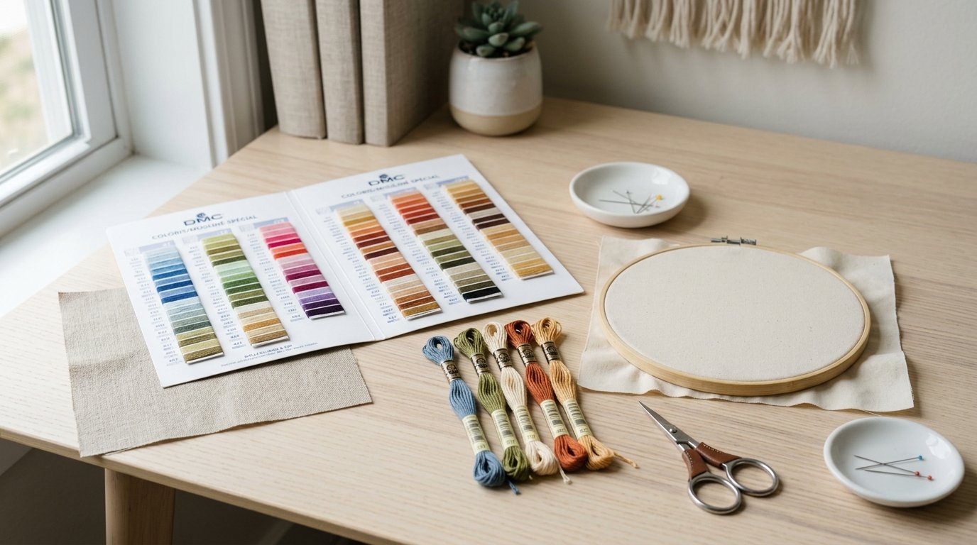
It also helps to remember that floss color changes depending on context. A shade that looks fine alone may disappear next to fabric, blend into a nearby stitched area, or create too much contrast. So the card should be used with your project materials nearby whenever possible. Lay the card against your fabric and compare candidate colors under daylight or a bright neutral lamp.
In short, the card is not only for identifying a color. It is for judging how that color behaves beside other colors in a real project.
Practical Guidance
To use a DMC thread color card well, follow a simple process.
1. Start with your goal.
Are you matching a pattern, replacing a missing skein, building a palette from scratch, or checking if two shades are different enough? Your goal changes what you compare.
2. Use real lighting.
Natural daylight is best. Warm indoor bulbs can make creams, reds, and browns look more yellow, while cool LEDs can flatten blues and grays.
3. Find the closest color family first.
If you need a sage green, do not compare it to every green on the card. Narrow to muted greens, then compare lightness and undertone.
4. Compare at least three neighboring options.
Do not stop at the first good match. Many DMC shades are close, and the best substitute is often one number lighter, darker, warmer, or duller than your first pick.
5. Check contrast against the fabric and nearby thread colors.
This is especially important in cross stitch, where symbols may call for subtle shading. If two shades nearly disappear when viewed from arm’s length, choose a clearer step between them.
Here are a few common situations:
- Pattern color unavailable: If a dusty rose is missing, choose a substitute with similar value first, then similar warmth. A brighter pink may match the family but change the design’s mood.
- Creating depth: For flower petals or leaves, choose three to five shades that move clearly from highlight to shadow rather than several almost-identical mids.
- Matching vintage work: Use the card to find a modern DMC color that matches the current stitched appearance, not just what you think the original color was.
A few mistakes are easy to avoid. Do not rely only on online images. Do not compare one loose skein under poor light and assume it matches. And do not substitute based only on “close enough” color names, since DMC numbers matter more than descriptive labels.
If you stitch often, mark your most-used families or keep notes on successful substitutions. The card becomes more useful the more you treat it as a working studio reference rather than a one-time shopping aid.
FAQ
Is a Threaded Dmc Color Card Better Than a Printed One?
Yes. A threaded card uses actual floss, so you see the real sheen, depth, and undertone of the thread. Printed cards are helpful for general reference, but they are less accurate for close matching, substitutions, and choosing between similar shades.
Can I Use a Dmc Color Card to Match Other Embroidery Floss Brands?
Yes, but use it as a visual guide, not an exact conversion guarantee. Compare the other brand’s thread directly to the DMC samples in good light, then choose the closest match by value and undertone, since brand-to-brand color charts are not always perfect.
How Do I Choose Between Two Very Similar Dmc Shades?
Put both options next to your fabric and the colors around them in the design. Then step back slightly. If one creates clearer contrast or fits the palette better, choose it. Small differences often matter more in context than they do on the card alone.
Do I Need a Color Card If I Already Have a Pattern with Dmc Numbers?
Not always, but it is still useful. A pattern number tells you what to buy, while the card helps you verify a shade, compare nearby colors, and make substitutions if a skein is missing, discontinued, or not giving the effect you want.