
Choosing colour for embroidery or cross stitch is easier when you stop trying to find the “perfect” palette and use a practical method instead. The five most useful ways to choose colour are: work from the pattern’s intent, use a colour wheel, start with one hero thread, match the mood of the project, and test threads against fabric before committing. These methods help whether you are designing from scratch, changing a kit palette, or substituting floss you already own.
Quick Answer
The main takeaway: choose embroidery colours by giving yourself a clear starting point, then checking that the threads work together on the fabric you will actually stitch on.
Here are five reliable ways to choose colour:
- Follow the pattern’s purpose. Ask what the design needs to show first: realistic flowers, bold lettering, a soft sampler, or a decorative border.
- Use the colour wheel. Pick related colours for harmony, opposite colours for contrast, or one colour family for a calm finish.
- Begin with a hero thread. Choose one thread you love, then build supporting shades around it.
- Choose by mood. Soft pastels, rich jewel tones, earthy neutrals, and bright primaries all create different feelings.
- Test before stitching. Lay threads on the fabric, view them in daylight, and stitch a small sample if the choice is important.
For embroidery and cross stitch, colour is not only about beauty. It affects legibility, depth, contrast, and how much your stitches stand out. A pale pink flower may disappear on cream linen, while the same pink can look fresh on grey or navy fabric.
How to Think About This Topic
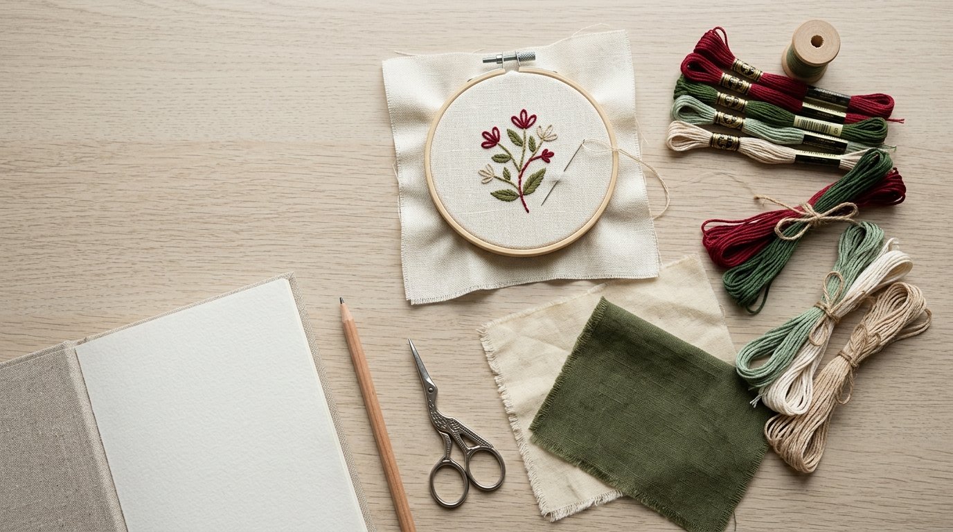
A useful mental model is to think of colour selection as three layers: design, thread, and fabric.
The design tells you what the colours need to do. In a cross stitch robin, the red breast needs to read clearly as the focal point. In a floral hoop, the leaves may need several greens so the stems, veins, and shadows do not look flat. In a quote design, the lettering must be readable before it is decorative.
The thread gives you the actual colour, texture, and shine. Cotton floss, silk, wool, metallic thread, and variegated thread can all behave differently. A colour that looks subtle on a skein may become stronger when stitched in dense satin stitch. A variegated thread can look beautiful in a border but distracting in a tiny face or detailed motif.
The fabric changes everything. Threads look different on white aida, natural linen, black evenweave, or coloured cotton. Light fabric tends to brighten colours. Dark fabric increases drama but can swallow very deep shades. Natural linen can make colours feel warmer and more muted.
This is why the best colour choices are not made from thread cards alone. They are made by comparing the thread to the fabric and to the purpose of the piece.
For practical stitching, the five ways to choose colour work like decision paths. If you are following a pattern, start with the pattern’s intent. If you are creating your own palette, use the colour wheel or a hero thread. If the piece is a gift, choose by mood or recipient. If you are substituting threads, test contrast and value before stitching the full project.
“Value” simply means how light or dark a colour is. It matters more than many beginners expect. Two colours may look different in the skein but blend together once stitched if they are the same value. Good embroidery palettes usually include a mix of light, medium, and dark shades so details remain visible.
Practical Guidance
1. Follow the Pattern’s Purpose
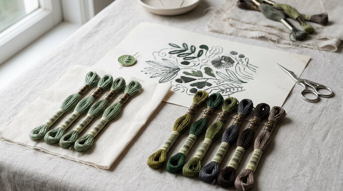
Before changing colours, ask what the original palette is doing. Is it realistic, decorative, vintage, seasonal, or high contrast? If a pattern uses three greens in a leaf, do not replace them with three nearly identical greens unless you want a flatter look. If a cross stitch chart uses dark backstitch around pale motifs, keep enough contrast for the outline to show.
This method is best when adapting a pattern without losing the designer’s structure.
2. Use the Colour Wheel
The colour wheel helps you choose relationships rather than random colours. For a calm embroidery palette, use neighbouring colours such as blue, blue-green, and green. For a bold design, pair opposites such as blue and orange or purple and yellow. For a simple sampler, try one colour family in several values, such as pale blue, mid blue, and navy.
You do not need advanced colour theory. Use the wheel to decide whether you want harmony, contrast, or a limited palette.
3. Start with One Hero Thread
A hero thread is the colour you most want to include. It might be a variegated floss, a favourite red, or a metallic gold. Place it at the centre of the palette, then choose quieter supporting colours.
For example, if your hero thread is a variegated pink-to-coral floss, pair it with soft green leaves, cream highlights, and perhaps one dark rose for depth. Avoid adding too many other attention-grabbing colours, or the design may feel busy.
This works well for hoops, bookmarks, borders, and small gifts.
4. Choose Colours by Mood
Colour can make the same design feel completely different. A floral wreath in dusty pink, sage, and cream feels gentle and vintage. The same wreath in fuchsia, teal, and yellow feels bright and modern. A Christmas motif can be traditional in red and green, elegant in white and gold, or rustic in burgundy, pine, and linen brown.
When stitching for a nursery, wedding, memorial, or seasonal display, mood may matter more than realism.
5. Test Threads Before Committing
Always test if the project is large, detailed, or important. Lay all threads on the fabric and check them in daylight. Squint at the palette to see whether light and dark areas still separate. If two shades look too close, replace one.
For cross stitch, stitch a small block of ten to twenty stitches if you are unsure. For embroidery, test the actual stitch: satin stitch reflects colour differently from stem stitch, French knots, or long and short stitch.
A quick test can prevent hours of stitching with colours that disappear into the fabric.
FAQ
What Should a Beginner Know First About Five Ways to Choose Colour?
Start with contrast. Beautiful colours are not useful if the stitches cannot be seen. Choose a light, medium, and dark shade, place them on your fabric, and check whether each one stands out. This matters especially in cross stitch, lettering, and detailed embroidery.
What Matters Most When Evaluating Five Ways to Choose Colour?
The most important factor is how the colours work in the actual project. Consider the design, fabric colour, thread type, and stitch density together. A palette that looks lovely in skeins may look dull, harsh, or low-contrast once stitched.
What Mistakes Should Readers Avoid with Five Ways to Choose Colour?
Avoid choosing every colour at the same intensity. If all threads are bright, dark, or pale, the design can lose focus. Also avoid substituting colours only by name. “Rose,” “sage,” or “navy” can vary widely between brands and thread ranges.
What Is the Next Logical Step After Learning About Five Ways to Choose Colour?
Choose a small project and make two or three possible palettes. Lay each one on the fabric, remove any colours that do not show clearly, then stitch a tiny test. This builds confidence quickly and helps you understand colour through real stitching, not guesswork.