
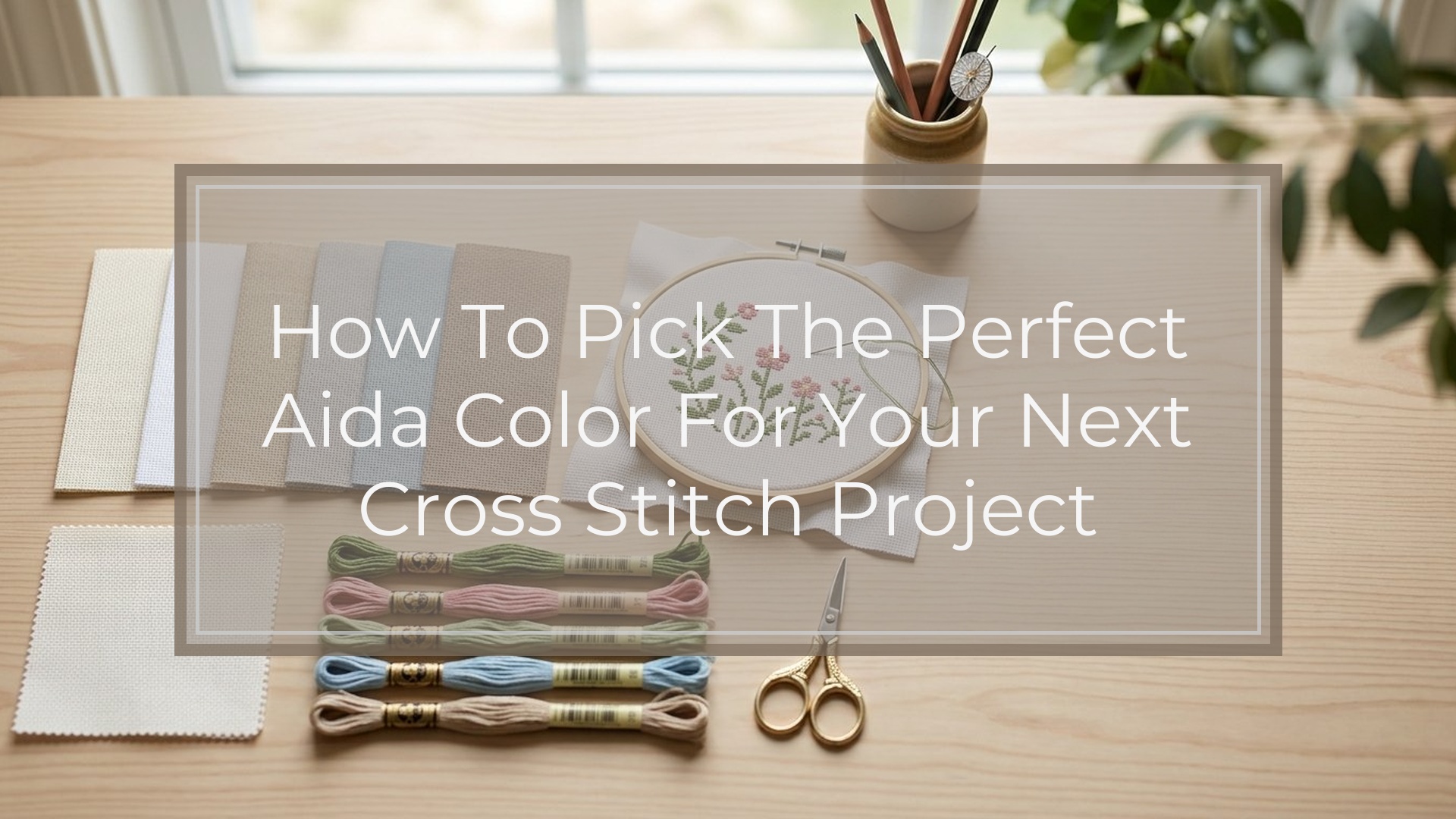
Choose Aida color by matching three things: the pattern’s needs, the thread contrast, and the finished look you want. Start with the chart notes, then check whether your lightest and darkest floss colors will stand out on the fabric. If the design has lots of white, cream, or pale pastels, avoid very light fabric unless the pattern is adjusted for it. If the project is decorative rather than strictly traditional, let the fabric act like a background color in a framed print: neutral shades keep attention on the stitching, while bold or hand-dyed shades add mood. When in doubt, pick a soft neutral such as white, ivory, or light gray, and always test a few thread colors against the fabric before buying a large cut.
Quick Answer
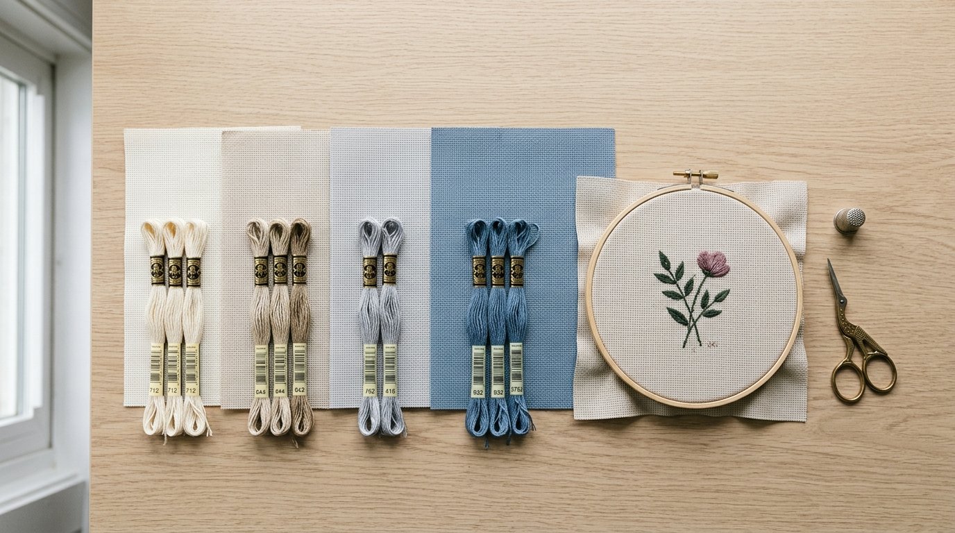
The main takeaway is simple: the perfect Aida color is the one that makes the design readable, supports the mood of the pattern, and does not fight your thread colors.
Start with the pattern. If it names a fabric color, treat that as your baseline because the designer likely chose floss shades for that background. Next, look at contrast. Your stitches should be easy to see both while you work and when the piece is finished. A snowy sampler may glow on navy, but a baby design stitched in pale pink and cream can disappear on ivory.
For most projects, these are the safest starting points:
- White or ivory: versatile, bright, and beginner-friendly
- Light gray or oatmeal: softer than white and flattering for modern palettes
- Black or navy: dramatic, but only if your thread colors are strong enough
- Hand-dyed or bold colors: best when the fabric is part of the design
If you are unsure, hold the key floss colors against the fabric. If the design edges blur or the light colors vanish, choose a different Aida shade.
How to Think About This Topic
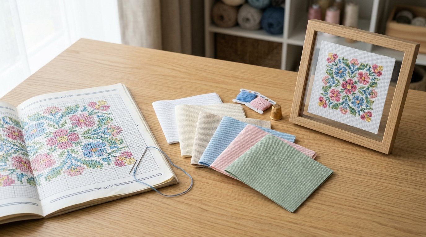
Aida color is not just a background choice. It affects visibility, color balance, and the overall style of the finished project. A useful mental model is to think about fabric color in this order: read the pattern, judge contrast, then choose the mood.
Read the Pattern First
Before shopping, check whether the chart specifies fabric color, stitch count, and full or partial coverage. This matters because some designs assume the fabric will show through. For example, winter charts often use the fabric as “snow,” and primitive patterns may expect an antique cream ground. If you swap the fabric color, you may need to change floss too.
If the pattern does not name a fabric, look at the stitched sample. Ask:
- Are there large open areas where fabric is visible?
- Are outlines or backstitching doing most of the definition?
- Are there many pale shades, especially white, ecru, yellow, or blush?
These clues tell you how much freedom you have.
Contrast Is the Real Decision-maker
When people ask how to pick the perfect Aida color for your next project, they are usually really asking, “What color will make my stitching look its best?” Contrast answers that.
Good contrast means your stitches stand out clearly from the background. Too little contrast makes the design muddy. Too much contrast can also change the look, making a soft floral feel harsher than intended. The goal is not maximum contrast in every case, but useful contrast.
A quick rule:
- Light threads need medium or dark fabric to pop
- Dark threads need light or medium fabric to pop
- Mid-tone threads work on many neutrals but can flatten on similar shades
The Fabric Also Sets the Style
Once the pattern works and the contrast is solid, think about the finished look. White Aida feels crisp and traditional. Ivory warms up vintage, cottage, and sampler designs. Gray can make modern botanicals and typography look more refined. Black creates drama for Halloween, celestial, and jewel-tone projects.
That is why color choice should tie back to your actual project goal. If you want the stitching to be the only star, choose a quiet neutral. If you want the background to add atmosphere, pick a color that behaves like part of the artwork.
Practical Guidance
Use this step-by-step selection process when buying Aida, especially if you are choosing without seeing a stitched model in person.
1. Match the Design Category to a Fabric Family
| Aida color | Best effect | Good for | Watch out for |
|---|---|---|---|
| White | Clean, bright, high clarity | Samplers, baby gifts, everyday charts | Can feel stark with muted or antique palettes |
| Ivory/Cream | Warm, soft, classic | Florals, vintage motifs, seasonal pieces | White floss may lose definition |
| Light Gray | Modern, balanced, subtle | Typography, botanicals, contemporary decor | Some blues and silvers can blend in |
| Oatmeal/Beige | Natural, rustic, earthy | Folk art, primitive, farmhouse styles | Fine detail may look less crisp |
| Black | Dramatic, rich, high contrast for light floss | Halloween, celestial, ornament stitching | Harder to see holes; dark floss disappears |
| Navy/Deep Blue | Softer drama than black | Winter scenes, stars, holiday designs | Similar blues and purples may flatten |
| Hand-dyed/Bold colors | Artistic, atmospheric, unique | Small decorative pieces, focal designs | Can compete with detailed charts |
2. Check the Lightest and Darkest Floss Colors
Do not judge from the whole pattern image alone. Look at the extremes. If the chart uses white, 3865, pale yellow, or very soft skin tones, test those against the fabric first. Then check the darkest shades. On black Aida, a design with charcoal outlines may lose structure. On cream Aida, a piece full of white flowers may need brighter highlights or darker outlining.
A simple in-store or at-home test helps: place the floss bobbins or skeins on the fabric and step back. If you can still separate the colors from the background at a glance, the contrast is probably workable.
3. Think About Where the Fabric Will Show
For full-coverage cross stitch, fabric color matters less because the stitches hide most of it. In those cases, your choice is mainly about comfort while stitching and what little may show at edges or mistakes. For partial-coverage designs, fabric color matters a lot more because it becomes visible negative space.
Examples:
- A floral wreath with open center: fabric is part of the design
- A full-coverage landscape: fabric mostly disappears
- A sampler with scattered motifs: fabric strongly shapes the final look
4. Factor in Your Stitching Experience
Some Aida colors are beautiful but less forgiving. Black, navy, and heavily mottled fabrics can make holes harder to see, slow your counting, and increase eye strain. That does not mean you should avoid them forever. It just means they are better chosen on purpose.
If you are newer to cross stitch, start with white, ivory, or a light neutral gray. If you want dark drama, consider good lighting, a needle minder with a bright threader, or gridding first.
5. Use a Fast Final Checklist Before Buying
Choose the fabric if you can answer yes to most of these:
- Does it suit the pattern’s intended style?
- Do the lightest and darkest floss shades both show clearly?
- Will visible background areas look intentional?
- Is it comfortable for your skill level and lighting setup?
- Will it fit the room, frame, or gift style once finished?
If one answer is no, you may still use that color, but make the tradeoff knowingly.
FAQ
Is White Aida Always the Safest Choice?
White Aida is the safest general-purpose option, but not always the best-looking one. It gives clear contrast for many charts, yet it can feel too stark for vintage, rustic, or muted designs. Ivory, oatmeal, or light gray often produce a softer, more polished finish.
How Do I Know If My Thread Colors Will Show up on Dark Aida?
Check the palest floss shades first, especially white, blush, pale blue, and soft yellow. Place the skeins on the fabric and view them from arm’s length. If edges blur or colors sink into the background, you may need a lighter fabric or adjusted thread choices.
Does Fabric Color Matter for Full-coverage Cross Stitch?
It matters less than with partial-coverage designs because the stitches hide most of the fabric. Still, fabric color can affect your stitching comfort, visibility of holes, and how noticeable any small gaps or edge areas are. Many stitchers choose lighter neutrals for easier counting.
Should Beginners Avoid Black or Hand-dyed Aida?
Not necessarily, but they are less forgiving. Black Aida can be harder to count, and hand-dyed fabric may reduce hole visibility or compete with delicate color changes. Beginners usually have an easier time on white, ivory, or light gray before moving to darker or more complex backgrounds.
Can I Change the Fabric Color from What the Pattern Suggests?
Yes, if you check contrast and accept that the design may look different. Fabric color changes can improve style or match your decor, but pale floss, shading, and open areas may need adjustment. When possible, test a few key thread colors before committing to the swap.